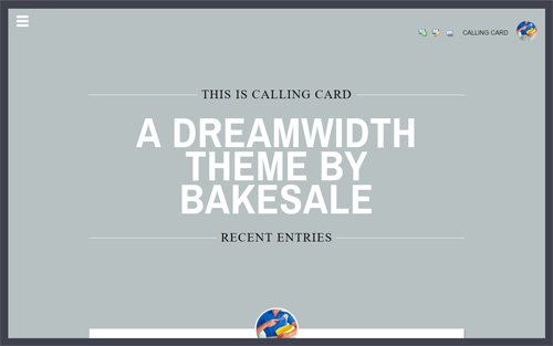
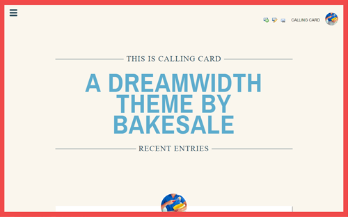
Entry tags:
THEME 002: Calling Card

HOW TO INSTALL THE THEME
- PLEASE NOTE! This theme requires both a TITLE AND SUBTITLE to look right. The subtitle is the large text you see in the header.
- Read my Terms of Use. By continuing installation, you are agreeing to full compliance with these terms.
- From the Select Journal Style page, choose the Plain theme for Tabula Rasa.
- On the same page, scroll down to section 3. Choose a Page Setup and select 1 Column (modules at bottom; no sidebar).
- Click Customize Selected Theme at the bottom right.
- On the Presentation tab, scroll all the way down and select icons from the last 3 drop-down menus.
- On the Modules tab, make sure that Profile, Navigation, and Style Credit are all selected and placed in the Main Module Section. (Note: The Profile module is optional, but if you do want it on the layout, it must be placed in the Main Module Section.)
- Also in the Modules tab, select additional desired modules for the Main Module Section or Secondary Module Section, if any. These will appear at the bottom of the theme.
- On the Custom CSS tab, deselect "Use layout's stylesheet(s)" (there should be NO CHECKMARK), paste the code for your chosen color scheme into "Use embedded CSS" and save.
THE CUSTOM CSS CODE

PROFESSOR

CABBAGE ROSE

DECORUM

HI-FI

LAST RESORT

PATISSERIE

SALUT

SCRUNCHIE
CUSTOMIZATIONS
Remove the large first letter in posts:
Open the code in a text editor like Notepad. Search for
Color hex codes:
"Professor" is the easiest scheme to find and replace the colors on.
ENJOY!
If you decide to use this theme, I'd love to know, and would particularly love to see it in action if you care to link the journal! Please feel free to ask questions about this theme in the comments to this post.
Known Issues:
- The links for post headers do not work. This has to do with the way I positioned the icon; I may or may not fix this later.
- In Chrome, the post's icon overlaps the post title a little when the title is extremely long.
- In Edge, the comment content overlaps the comment interaction/link bar.
- On reading pages, entries from feeds have content overlapping the header. FIXED: CODE HERE.
Open the code in a text editor like Notepad. Search for
.entry-content:first-letter. Then remove all of the following:.entry-content:first-letter {
float: left;
color: #3f424d;
font-family: 'Times New Roman', Georgia, serif;
font-size: 75px;
padding: 4px 4px 3px 0;
}Color hex codes:
"Professor" is the easiest scheme to find and replace the colors on.
#3f424d
#b7c1c2
#f2f2f2
If you decide to use this theme, I'd love to know, and would particularly love to see it in action if you care to link the journal! Please feel free to ask questions about this theme in the comments to this post.
Known Issues:
- The links for post headers do not work. This has to do with the way I positioned the icon; I may or may not fix this later.
- In Chrome, the post's icon overlaps the post title a little when the title is extremely long.
- In Edge, the comment content overlaps the comment interaction/link bar.
- On reading pages, entries from feeds have content overlapping the header. FIXED: CODE HERE.
no subject
no subject
one customisation i can't work out is how to not show the user icon without ruining the positioning of everything else. is that possible? or, if not, is it possible to display it at a smaller size?
thank you very much.
no subject
.entry .userpic img {
    display: none;
}

.entry-content {
    margin-top: 200px;
}
If there's any problems, let me know!
(no subject)
no subject
Secondly, I was wondering if you could give me some way to remove the headers (and most of the space between the top and the first entry) in the layout without it removing all the space at the top and cutting off the top of the icon? I feel sure it must be something in this section of code:
#header, #footer {
margin: 0;
clear: both;
padding: .5em;
}
#header {
background: transparent;
padding: 18vh 0;
text-align: center;
}
h1#title span {
background: #b7c1c2;
font-weight: normal;
font-size: 70%;
font-size: 3.3vmin;
letter-spacing: 2px;
padding: 0 10px;
text-transform:uppercase;
}
h1#title {
margin-bottom: -29px;
}
h2#subtitle {
border-top: 1px solid #fff;
border-bottom: 1px solid #fff;
color:#fff;
font-family: 'Archivo Narrow', Helvetica, Arial, sans-serif;
font-size: 500%;
font-size: 11.3vmin;
font-weight: 700;
letter-spacing: 2px;
line-height: 80%;
margin:0 auto;
padding: 50px 0 55px 0;
text-transform: uppercase;
width:70%;
}
h2#pagetitle span {
background: #b7c1c2;
font-size: 90%;
font-size: 3.3vmin;
font-weight: normal;
letter-spacing:2px;
padding: 0 10px;
text-transform:uppercase;
}
h2#pagetitle {
margin-top: -27px;
}
I added a display: none; under the #header portion, since that's worked with other layouts, but that just results in moving the entry all the way to the top of the page with no margin and cutting off the top of the icon. I thought adding in a margin-top: somewhere would fix this, but I haven't any idea where to put it.
Apologies for being a newb lol, still learning css.
no subject
/* HEADER & FOOTER */
#header, #footer {
margin: 0;
clear: both;
padding: 20px;
}
#header {
background: transparent;
padding: 25px;
text-align: center;
}
h1#title span {
background: #b7c1c2;
font-weight: normal;
font-size: 70%;
font-size: 3.3vmin;
letter-spacing: 2px;
padding: 0 10px;
text-transform:uppercase;
}
h1#title {
display: none;
}
h2#subtitle {
display: none;
}
h2#pagetitle span {
background: #b7c1c2;
font-size: 90%;
font-size: 3.3vmin;
font-weight: normal;
letter-spacing:2px;
padding: 0 10px;
text-transform:uppercase;
}
h2#pagetitle {
display: none;
}
Of course, the layout maker may have a better way of doing it.
(no subject)
no subject
no subject
I may need to make the center column/journal box wider so it isn't three words wide on my phone, but I think I can probably figure out how to do that. Will see!
So pretty!
no subject
no subject
no subject
(no subject)
(no subject)
(no subject)
(no subject)
(no subject)
(no subject)
(no subject)
(no subject)
(no subject)
(no subject)
no subject
no subject
no subject
♥
no subject
no subject
(no subject)
no subject
Thank you so much! Your themes are so beautiful!
no subject
(no subject)
(no subject)
(no subject)
no subject
no subject
no subject
no subject
no subject
no subject
no subject
no subject
no subject
all of my journal entries are private, so i've credited you in my profile.
no subject
no subject
(no subject)
(no subject)
(no subject)
(no subject)
(no subject)
no subject